
If your Instagram grid looks like a random mood board of everything you have ever shot, you are leaving followers, clients, and bookings on the table. A consistent Instagram feed photography style is not about being repetitive. It is about building a recognizable visual identity, the same way a fashion house or a magazine does.
In this guide, we will walk you through a practical system to treat your feed like a brand, not a camera roll. You will learn how to define a palette, lock in your edit, keep your subjects cohesive, and plan your grid with intention.
Why Your Instagram Feed Should Be Treated Like a Brand Identity
When someone lands on your profile, they decide in about 3 seconds whether to follow. That decision is not made photo by photo. It is made grid by grid. A cohesive feed signals:
- Professionalism: you know what you shoot and why
- Reliability: clients know what to expect if they hire you
- Memorability: your work stands out in a saturated scroll
Think of your feed as a brand identity system. It has a color palette, a tone of voice (your captions), a typography (your subject choices), and a layout. Every post is a touchpoint of that brand.

Step 1: Define Your Color Palette
Color is the fastest way the human eye recognizes consistency. Before you touch Lightroom, decide on 3 to 5 dominant tones that will appear in most of your shots.
How to pick your palette
- Pull 20 of your favorite images from your archive
- Drop them into a tool like Coolors or Adobe Color to extract dominant hues
- Identify the 3 to 5 tones that repeat
- Commit to those tones for the next 90 days
Common palette directions for photographers in 2026
| Palette | Best For | Mood |
|---|---|---|
| Warm earth (terracotta, sand, cream) | Wedding, lifestyle | Intimate, timeless |
| Muted pastels (blush, sage, dusty blue) | Newborn, editorial | Soft, romantic |
| High contrast B&W | Street, documentary | Bold, journalistic |
| Moody teal & orange | Travel, landscape | Cinematic |
| Clean neutrals (white, beige, grey) | Product, brand | Minimal, premium |
Step 2: Build or Buy One Editing Preset (and Stick to It)
The single biggest reason feeds look messy is that photographers use a different edit for every post. Your preset is your visual signature.
What your preset must control
- White balance range: cool, neutral, or warm
- Contrast curve: matte lifted blacks, or punchy S-curve
- Skin tones: how oranges and reds are handled
- Greens and blues: foliage and sky treatment
- Grain and clarity: film-like or clean digital
Build one master preset with 2 or 3 variants for different lighting (indoor, golden hour, overcast). Apply it to every photo you post. If an image cannot be salvaged with your preset, it does not belong on the feed.

Step 3: Subject Consistency (The Underrated Rule)
Color and edit only take you halfway. The subjects you shoot must also feel like they belong in the same visual world. This is where most photographers slip. See thepreviewapp.com for their take.
A great feed balances variety with cohesion. Danielle Gervino puts it well: your feed should mix full-body, half-body, seated, detail, and filler shots. The variety keeps the grid dynamic, the cohesion keeps it branded.
The 5 shot types to rotate
- Hero shot: your strongest, portfolio-level image
- Detail shot: hands, texture, an object close-up
- Environmental shot: subject in context, wider frame
- Filler / texture: a wall, a sky, a flat lay to breathe the grid
- Portrait / face: emotional connection
Step 4: Plan Your Grid Like a Designer
Never post reactively. Plan 9 to 12 posts ahead using a grid preview tool such as Planoly, Later, or UNUM. Drag, drop, and rearrange until the 3×3 block feels balanced.
Grid patterns that work
- Checkerboard: alternate dark and light posts
- Row by row: each row shares a theme or color
- Column: middle column is quotes or fillers, outer columns are photos
- Puzzle: images that flow into each other (advanced)
Before & After: Two Real Feed Transformations
Case 1: The Wedding Photographer
Before: mix of bright bridal portraits, dark reception dance floors, some overly saturated sunset shots, a few phone snaps. Feed reads chaotic. (via https://canva.com)
After: committed to warm earth palette, lifted matte blacks, only posts golden hour and window-light images. Reception shots moved to Stories only. Result after 4 months: follower growth doubled and inquiries mentioned “your style” as the reason.
Case 2: The Travel Creator
Before: every destination edited differently, some HDR, some flat, some vintage. Feed looked like a stock library.
After: one moody teal and orange preset, checkerboard grid alternating landscape and human subject. Six months in, three brand partnerships landed specifically because the feed felt like a curated magazine.

Answering the Big Instagram Rules Photographers Ask About
What is the 5-3-1 rule on Instagram?
Engage with 5 accounts in your niche, leave 3 thoughtful comments, and make 1 new connection each day. It fuels the growth side of a well-branded feed.
What is the 3-2-1 rule on Instagram?
For every 6 posts: 3 educational, 2 entertaining, 1 promotional. Applied to photographers: 3 portfolio pieces, 2 behind-the-scenes, 1 booking call to action.
What is the 80-20 rule in photography for social?
80% of your posts should serve your audience (inspiration, education, storytelling), and 20% should sell your services or products directly.
The 10 Point Consistency Checklist
- Palette of 3 to 5 colors defined
- One master preset built
- 2 to 3 lighting variants of that preset
- Subject types rotated across 5 categories
- Grid planned 9 posts ahead
- No phone snapshots on the main grid
- White balance kept in a defined range
- Skin tones handled the same way every time
- Reels covers designed to match the feed
- Bio, highlight covers, and profile photo aligned with the palette
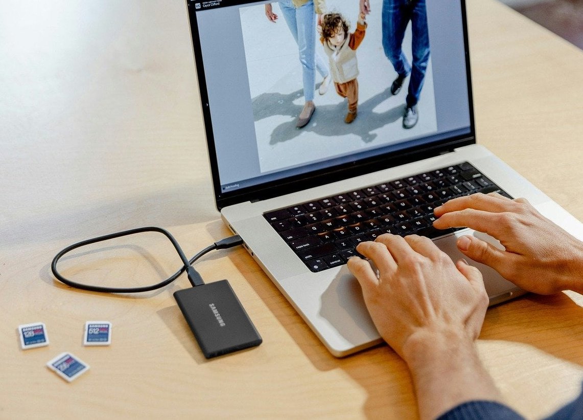
Tools Worth Using in 2026
- Planoly / Later / UNUM: grid preview and scheduling
- Lightroom Mobile: preset sync across devices
- Coolors / Adobe Color: palette extraction
- Canva: matching Reels covers and quote posts
- Dehancer / VSCO: film emulation if that is your direction
Final Thoughts
A consistent Instagram feed photography style is not a filter you slap on. It is a design system built from a palette, a preset, a subject rotation, and a grid plan. Commit to one direction for 90 days, resist the temptation to post everything you shoot, and your feed will start doing the marketing work for you.
Your feed is your storefront. Design it like one.
FAQ
How long does it take to build a cohesive Instagram feed?
Expect 30 to 90 days of intentional posting before the grid fully reflects your new identity. If you post 3 times a week, that is roughly 12 to 36 photos, enough to fully refresh what visitors see.
Should I delete old posts that do not match?
Archive rather than delete. Archiving hides posts from your grid without losing the engagement history. Focus on archiving the images that break your new palette or edit.
Can I have more than one style on my feed?
Technically yes, but it dilutes recognition. If you must, separate them by using distinct rows or columns, or better, create a second account for the other niche.
Do Reels break a cohesive feed?
Only if the covers are inconsistent. Design custom Reels covers in Canva using your palette so they blend into the grid seamlessly.
What is the fastest fix for a messy feed?
Apply one preset to your next 9 posts and archive anything that clashes. In two weeks your profile will look like a different photographer’s, in the best way.