
Starting a new business and wondering how to create a brand identity that actually looks professional and connects with customers? You’re in the right place. Instead of dropping generic tips, we’ll walk through the entire process using a fictional small business as our running example: “Maple & Crumb”, a neighborhood artisan bakery opening in a mid-sized city.
By the end, you’ll see exactly how research feeds into positioning, how positioning shapes visual choices, and how everything gets locked into a usable brand guidelines document. Let’s build it together.
What Is a Brand Identity (and What It Isn’t)
A brand identity is the collection of visual, verbal, and strategic elements that make your business recognizable and meaningful. It includes your logo, colors, typography, imagery, voice, and the values behind them.
It is not just a logo. A logo is one asset inside a much bigger system. Think of the brand identity as the personality; the logo is the face. You can read more here.
The Core Elements You’ll Build
- Brand strategy (mission, values, positioning)
- Verbal identity (name, tagline, voice)
- Visual identity (logo, color, typography, imagery)
- Brand guidelines document

Meet Our Example Business: Maple & Crumb
To make each step concrete, we’ll follow Maple & Crumb, a bakery founded by a former pastry chef who wants to serve slow-fermented breads and pastries using locally sourced ingredients. Budget is tight, competition is real, and the owner needs a brand that feels warm, honest, and slightly upscale without being pretentious.
Step 1: Research Your Market, Audience, and Competitors
You can’t design a meaningful brand in a vacuum. Research is where 80% of good decisions come from.
What to research
- Your audience: demographics, lifestyle, buying triggers, pain points.
- Your competitors: what they look like, how they speak, where they’re weak.
- Category codes: the visual clichés of your industry (so you can lean in or break away).
Maple & Crumb in action
Research revealed three main competitors: a big chain bakery (cheap, industrial), a hipster micro-bakery (loud branding, dark palette), and a traditional French patisserie (formal, gold accents). Target customers are 28-50 year olds who value quality food, sustainability, and neighborhood businesses. Gap identified: warm and approachable, but crafted and premium. There’s a solid take on this from a design studio worth a look.
Step 2: Define Your Positioning and Core Message
Positioning is a single sentence that answers: who are you for, what do you offer, and why are you different?
A simple positioning formula:
For [target audience], [brand name] is the [category] that [key benefit] because [reason to believe].
Maple & Crumb’s positioning
“For neighborhood food lovers who care where their food comes from, Maple & Crumb is the artisan bakery that serves slow-fermented breads and pastries made with locally sourced ingredients, because we bake everything from scratch, in small batches, every morning.”
Add your brand pillars
- Craft: handmade, no shortcuts
- Locality: local grains, local suppliers
- Warmth: friendly, community-first
- Honesty: transparent about ingredients and process
Step 3: Nail the Verbal Identity
Before touching any design, define how the brand sounds. Words shape design more than people think.
Voice attributes (pick 3 to 4)
| We are | We are not |
|---|---|
| Warm | Cold or clinical |
| Straightforward | Salesy or hyped |
| Curious | Know-it-all |
| Grounded | Trendy for trend’s sake |
Tagline options tested for Maple & Crumb: “Baked slow. Served fresh.” was the winner because it captured both craft and immediacy.
Step 4: Design the Logo
The logo is a container for meaning, not the meaning itself. It should be simple, scalable, and appropriate for the positioning. Source: https://columnfivemedia.com.
Types of logos to consider
- Wordmark: name in a custom typeface (Google, Coca-Cola)
- Lettermark: initials (HBO, IBM)
- Symbol: abstract or literal icon (Apple, Nike)
- Combination mark: wordmark + symbol (most small businesses)
Maple & Crumb’s choice
A combination mark: a custom wordmark using a warm serif with slight hand-drawn imperfections, paired with a small icon of a wheat stalk shaped like a maple leaf. It works on signage, coffee cups, and tiny social avatars.
Logo checklist
- Legible at 24px favicon size
- Works in one color (black on white, white on black)
- No dependency on gradients or effects
- Has clear space rules around it
Step 5: Choose Colors and Typography
Color palette
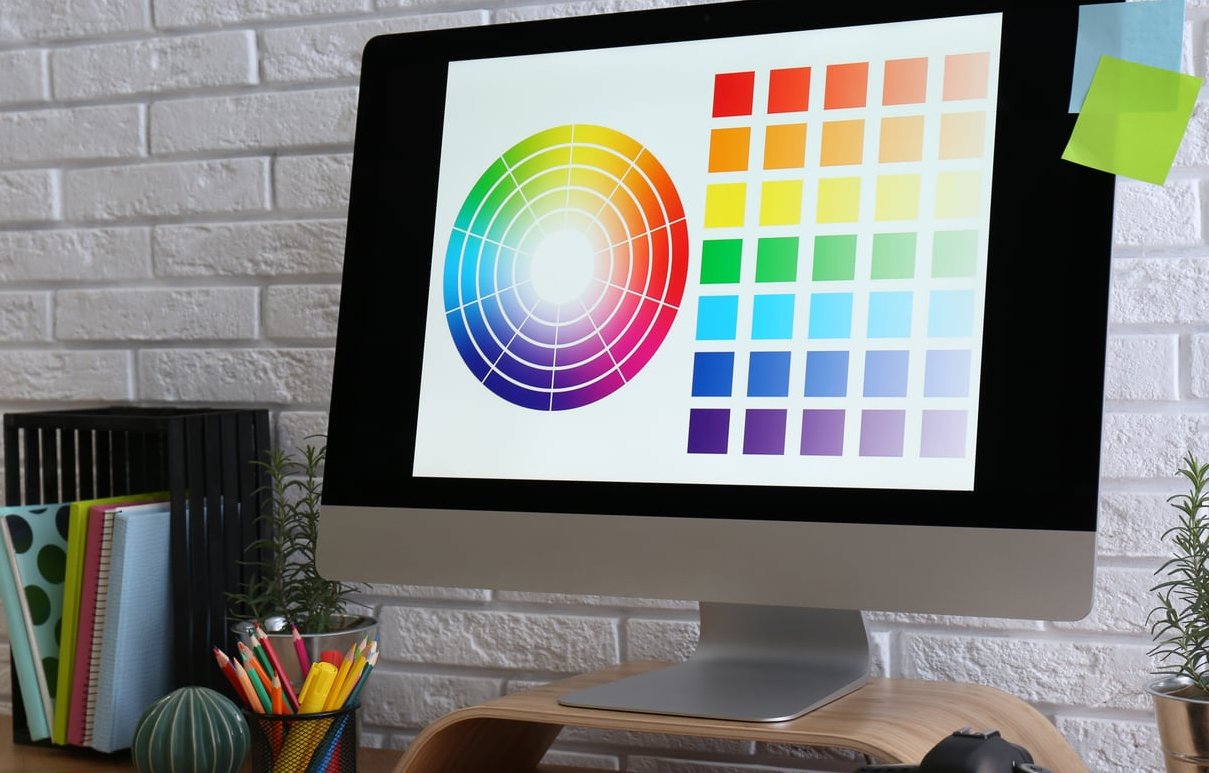
Pick a palette that reflects your positioning and works across screens and print. A solid starter palette has:
- 1 or 2 primary colors
- 2 to 3 secondary colors
- 1 neutral (light background)
- 1 dark for text
Maple & Crumb landed on:
| Role | Color | Hex |
|---|---|---|
| Primary | Warm terracotta | #C25A3B |
| Primary | Deep bark brown | #3B2A1F |
| Secondary | Wheat gold | #D9B26A |
| Neutral | Cream | #F5EEDD |
| Dark | Espresso | #1F1712 |
Typography
Two typefaces are usually enough:
- Display font for headlines (character, personality)
- Body font for readability (neutral, clean)
Maple & Crumb uses a warm humanist serif for headlines and a modern geometric sans-serif for body text. Rule of thumb: contrast your fonts, don’t compete them.
Step 6: Build Imagery and Supporting Assets
Photography, illustration style, patterns, and icons round out the identity. This is often where beginners stop too early.
Imagery direction for Maple & Crumb
- Natural daylight photography, no artificial studio lighting
- Close-up textures: flour, crust, hands kneading
- Real people, real staff, no stock models
- Slight film grain to reinforce craft feel
Supporting assets to prepare
- Business card and packaging templates
- Social media templates (post, story, cover)
- Email signature
- Website homepage design tokens
- Signage mockup
Step 7: Assemble Your Brand Guidelines
All of the above only works if it’s documented. Brand guidelines (also called a brand book) keep your team, freelancers, and future self consistent.
Minimum sections to include
- Brand story and mission
- Positioning and audience
- Voice and tone with do/don’t examples
- Logo usage: clear space, misuse examples, sizes
- Color palette with Hex, RGB, CMYK, and Pantone
- Typography hierarchy
- Imagery and photography direction
- Applications: business card, packaging, social media, website
A 15 to 25 page PDF is plenty for a small business. You don’t need a 200-page bible on day one.

Common Mistakes to Avoid
- Skipping research and jumping straight into Canva
- Chasing trends instead of building something distinctive
- Designing the logo first before knowing the positioning
- Too many colors and fonts that dilute recognition
- No documentation, which leads to visual drift within 6 months
Your 7-Step Recap
- Research market, audience, competitors
- Define positioning and brand pillars
- Craft the verbal identity and voice
- Design the logo
- Choose colors and typography
- Build imagery and supporting assets
- Assemble the brand guidelines
FAQ
How long does it take to create a brand identity from scratch?
For a small business doing it properly, expect 4 to 8 weeks. Research and positioning eat up half of that time; design happens faster once the strategy is locked.
Can I create a brand identity myself without a designer?
You can handle strategy, positioning, and voice on your own. For the logo and visual system, a professional designer will save you money in the long run because rebranding later is expensive.
What’s the 3-7-27 rule of branding?
It’s a memory model: it takes 3 impressions for someone to recognize your brand, 7 to remember it, and 27 to trust it. It’s a reminder that consistency and repetition matter more than any single asset.
How much should I budget for a brand identity as a new business?
Small businesses typically spend between $2,000 and $10,000 for a full identity with a freelancer or small studio. DIY can be near-zero but usually costs more time and rework.
What’s the difference between brand and brand identity?
Your brand is what people feel and say about you. Your brand identity is the toolkit you use to shape that feeling: logo, colors, voice, imagery, and guidelines.
Do I need a tagline?
Not always. A good tagline reinforces positioning, but a weak one is worse than none. If you can’t write one that adds meaning, skip it and revisit later.
Building a brand identity from scratch is one of the highest-leverage things you can do as a new business owner. Follow the seven steps above, keep your fictional (or real) example in mind, and remember: consistency beats cleverness every time.