
If you have ever exported a vibrant design from Photoshop only to receive a printed version that looks dull, washed out, or strangely shifted in tone, you have already met the difference between RGB and CMYK firsthand. At Impact Photography, we deal with this question on every project that crosses both screens and paper, and getting it wrong before client delivery is one of the most expensive mistakes a creative can make.
This guide breaks down the technical difference between the two color modes, explains why your files look different on screen versus in print, and shows you exactly when to switch modes inside Photoshop and Illustrator.
What Are RGB and CMYK?
Both RGB and CMYK are color models used to mix and reproduce colors, but they work in completely opposite ways.
RGB: Light-Based Color (Additive)
RGB stands for Red, Green, and Blue. It is an additive color model used by anything that emits light: computer monitors, smartphones, tablets, TVs, and digital cameras. When all three colors are combined at full intensity, you get pure white. When all are absent, you get black.
- Used for screens and digital displays
- Wider color gamut (more vibrant colors)
- Ideal for websites, social media, video, and digital ads
- File formats: JPG, PNG, GIF, MP4, SVG (digital web)
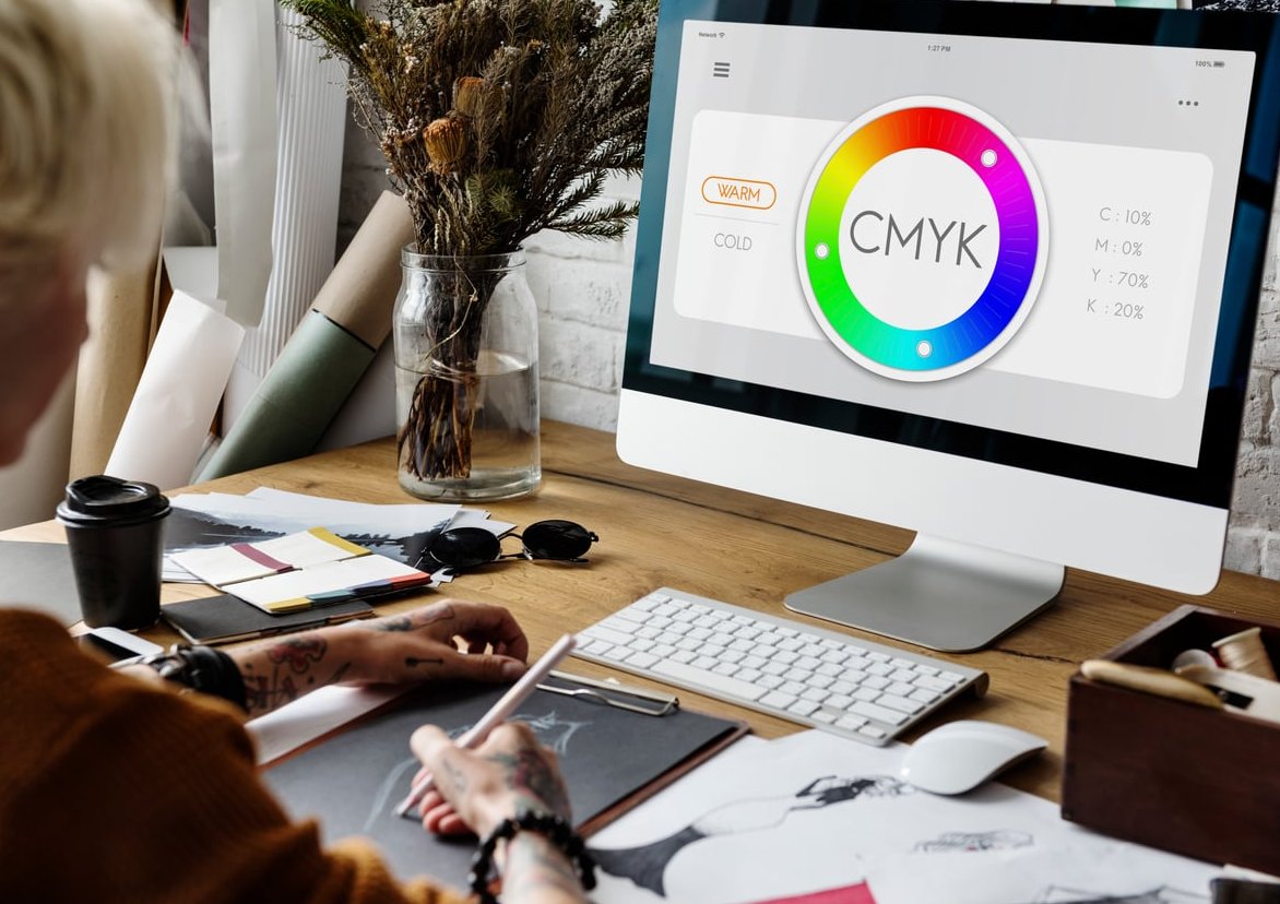
CMYK: Ink-Based Color (Subtractive)
CMYK stands for Cyan, Magenta, Yellow, and Key (Black). It is a subtractive color model used in printing. Inks absorb (subtract) light, and the colors you see are what bounces back from the paper. Combining all four inks produces a deep near-black.
- Used for any printed material
- Smaller color gamut than RGB
- Ideal for business cards, brochures, packaging, posters, books
- File formats for delivery: PDF/X, TIFF, EPS
RGB vs CMYK: Quick Comparison Table
| Feature | RGB | CMYK |
|---|---|---|
| Color Type | Additive (light) | Subtractive (ink) |
| Best Use | Digital screens | Physical print |
| Color Range | Wider, more vibrant | Narrower, more muted |
| Primary Channels | 3 (R, G, B) | 4 (C, M, Y, K) |
| Black Output | Absence of light | Combination of inks |
| Common Files | JPG, PNG, GIF | PDF/X, TIFF, EPS |
Why Do Files Look Different on Screen vs Print?
This is the question that frustrates most clients. A logo can look electric blue on a phone but appear noticeably duller on a printed flyer. Here is why:
- Color gamut difference: RGB can display millions of colors that simply cannot be reproduced with CMYK inks. Bright neons, electric blues, and saturated greens are the most common victims.
- Light vs reflection: A screen emits light directly into your eyes. A printed page only reflects ambient light. The same color signal will always look more luminous on screen.
- Paper and ink absorption: Uncoated paper absorbs more ink and produces softer, less saturated results. Coated paper holds ink better and prints closer to what you see on screen.
- Monitor calibration: An uncalibrated screen exaggerates the surprise. Two designers looking at the same RGB file on different monitors may see two different colors.
The takeaway: never judge a print job by what you see on your monitor unless your screen is properly calibrated and you are previewing in CMYK soft proof mode.

When to Use RGB
- Websites and landing pages
- Social media posts (Instagram, LinkedIn, TikTok)
- Email newsletters and digital banners
- Video content and motion graphics
- Mobile app interfaces
- Digital photography for online portfolios
When to Use CMYK
- Business cards, letterheads, and stationery
- Brochures, flyers, and posters
- Packaging and product labels
- Magazines, books, and catalogs
- Billboards and large-format print
- Branded merchandise (t-shirts, mugs, signage)
How to Switch Color Modes in Photoshop
Photoshop is built around raster images, so color mode conversion happens at the document level.
Convert from RGB to CMYK
- Open your file in Photoshop.
- Before converting, go to View > Proof Setup > Working CMYK, then View > Proof Colors (Ctrl/Cmd+Y) to preview how your image will look in CMYK without applying changes.
- Adjust saturation or contrast on a separate layer if needed to compensate for color loss.
- Go to Image > Mode > CMYK Color.
- Flatten layers if prompted, save a copy as PDF/X-1a or TIFF for print delivery.
Best Practice
Always keep a master file in RGB and export a CMYK copy for print. RGB to CMYK is a destructive conversion: once a vibrant color is clipped to the CMYK gamut, you cannot recover it by switching back.
How to Switch Color Modes in Illustrator
Illustrator works with vectors, so the color mode is set per document and applied to swatches.
Set or Change Document Color Mode
- Open your document.
- Go to File > Document Color Mode.
- Choose RGB Color or CMYK Color depending on the deliverable.
- Update your swatches: any RGB swatches will be approximated to CMYK and may shift visually.
- For print, export as PDF (Press Quality or PDF/X-4) with all fonts outlined or embedded.
Pro Tip for Brand Work
If you design logos and brand assets, always create two versions of every brand color: an RGB/HEX value for digital and a CMYK (and ideally Pantone) value for print. This avoids surprise color shifts when the client sends the logo to a printer.
Pre-Delivery Checklist for Clients
Before handing off any file, run through this list:
- Confirm the final usage: digital, print, or both
- Set the correct document color mode from the start when possible
- Soft proof CMYK in Photoshop before exporting
- Check resolution: 72 ppi for digital, 300 ppi for print
- Embed an ICC color profile (sRGB for web, FOGRA39 or GRACoL for offset print)
- Provide both an RGB and a CMYK file when the client may need both
- Include bleed (3mm/0.125 inch) on all print files
Common Mistakes to Avoid
- Sending an RGB file to a printer: the printer’s RIP will auto-convert and you lose control over the result.
- Designing print work in RGB and converting at the last minute: bright RGB colors get clipped and clients are disappointed.
- Working on an uncalibrated monitor: what you see is not what anyone else sees.
- Using pure black (0,0,0,100) for large areas: rich black (e.g., 40,30,30,100) prints deeper and avoids streaks.
- Forgetting to flatten transparency on print PDFs.
FAQ
Is it better to use CMYK or RGB?
Neither is universally better. Use RGB for anything viewed on a screen and CMYK for anything that will be physically printed. The right choice depends entirely on the final medium.
What happens if I print a file in RGB?
The printer or its software will automatically convert it to CMYK, but you will not control how that conversion happens. Bright colors may shift, and the result is often duller or different from what you intended on screen.
Do I need to convert RGB to CMYK before sending to a printer?
Yes, whenever possible. Converting yourself, with proper soft proofing, lets you adjust colors before the press does it for you. Some modern print workflows accept RGB with embedded profiles, but converting in advance is still the safest approach.
Why does CMYK look duller than RGB?
Because CMYK has a smaller color gamut and relies on reflected light from ink and paper, while RGB uses emitted light from a screen. The brightest, most saturated RGB colors simply cannot be reproduced with standard CMYK inks.
Can I convert CMYK back to RGB?
Technically yes, but the colors that were lost in the original conversion will not return. Always keep your original RGB master file as a backup.
What about Pantone colors?
Pantone (PMS) colors are pre-mixed spot inks used when brand color accuracy is critical, like on packaging or corporate identity. They sit outside the RGB/CMYK debate and are specified separately on the print order.
Final Thoughts
Mastering the RGB vs CMYK distinction is one of the simplest ways to look professional in front of a client. It saves reprints, prevents awkward conversations, and ensures your creative work translates faithfully from pixel to paper. Set the right mode at the start of your project, soft proof before delivery, and always provide your clients with the file format that matches their actual use case.
At Impact Photography, color accuracy is part of every shoot, retouch, and deliverable we hand over. If you need help preparing your visuals for both digital campaigns and print production, get in touch with our team.