
Whether you’re laying out a magazine spread, designing a landing page, or building a portfolio site, one principle separates clear communication from visual chaos: typography hierarchy. It’s the silent guide that tells readers where to look first, what to read next, and which details are simply there for support.
In this guide, we break down the three core levels of text (primary, secondary, tertiary) and give you immediately applicable rules for size, weight, and spacing. No theory dump, just decisions you can make on your next project.
What Is Typography Hierarchy?
Typography hierarchy is the visual system that organizes text by importance. Through deliberate choices in size, weight, color, spacing, and style, designers create a path for the reader’s eye to follow naturally, from the most critical message down to supporting details.
Without hierarchy, every word competes for attention. With it, content becomes scannable, digestible, and memorable. Think of it as wayfinding for the page.
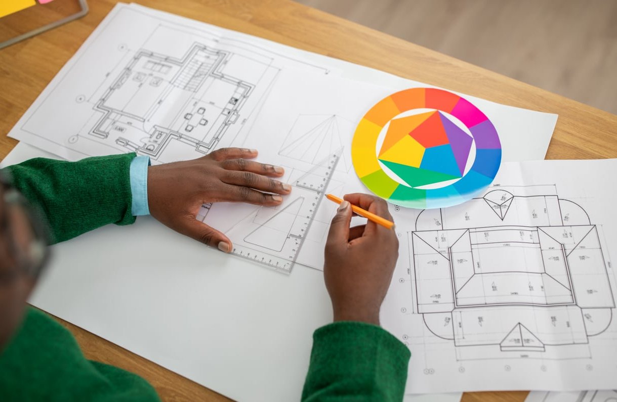
The Three Levels of Typographic Hierarchy
Most well-structured layouts rely on three functional tiers. Mastering these gives you 90% of what you need.
1. Primary Text (The Hero)
This is the largest, boldest element on the page. It carries the main message: a headline, a feature title, a hero statement.
- Purpose: Capture attention immediately.
- Typical size (web): 40 to 80 px on desktop.
- Typical size (print): 36 to 72 pt for editorial covers.
- Weight: Bold, black, or a distinctive display cut.
- Spacing: Tight line-height (1.0 to 1.2) and generous margins around it.
2. Secondary Text (The Connector)
Secondary text bridges the headline and the body. Subheadings, deck copy, section titles, and pull quotes live here.
- Purpose: Add context and break long content into scannable sections.
- Typical size (web): 20 to 32 px.
- Typical size (print): 14 to 24 pt.
- Weight: Medium or semi-bold, often in a contrasting style (italic, different family).
- Spacing: More breathing room above than below to anchor the section.
3. Tertiary Text (The Support)
This includes body copy, captions, metadata, footnotes, and labels. It’s the workhorse of the layout.
- Purpose: Deliver detailed information comfortably.
- Typical size (web): 14 to 18 px for body, 11 to 13 px for captions.
- Typical size (print): 9 to 11 pt for body.
- Weight: Regular, with occasional bold for emphasis.
- Spacing: Line-height 1.4 to 1.6 for readability.
A Quick Reference Table
| Level | Role | Web Size | Weight | Line-height |
|---|---|---|---|---|
| Primary | Headline / Hero | 40-80 px | 700-900 | 1.0-1.2 |
| Secondary | Subhead / Deck | 20-32 px | 500-600 | 1.2-1.4 |
| Tertiary | Body / Caption | 11-18 px | 400 | 1.4-1.6 |

Three Tools to Build Hierarchy: Size, Weight, Spacing
Size: The Most Obvious Cue
Bigger reads first. The trick is keeping ratios intentional, not random. A common approach is the modular scale, multiplying a base size (say 16 px) by a ratio like 1.25, 1.333, or 1.5.
Example scale with a 1.25 ratio starting at 16 px: 16, 20, 25, 31, 39, 49, 61, 76. Pick three or four steps from this scale and stick to them.
Weight: Hierarchy Without Changing Size
When two pieces of text need similar size but different importance, weight does the heavy lifting. A bold 18 px label commands more attention than a regular 18 px caption right next to it.
Modern variable fonts (Inter, Roboto Flex, Recursive) make this easier than ever, giving you fine-grained control from 100 to 900.
Spacing: The Underrated Hero
Whitespace creates groups and separates ideas. Two principles to remember:
- Proximity rule: Related elements should sit closer together than unrelated ones. A subhead belongs nearer to its paragraph than to the section above.
- Asymmetric margins: Always give a heading more space above than below. This visually anchors it to the content it introduces.
Web Example: A Blog Article Layout
Here’s how the three levels translate to a typical article:
- Primary: Article title, 56 px, bold, line-height 1.1.
- Secondary: Section H2s at 28 px, semi-bold, with 48 px top margin and 16 px bottom margin.
- Tertiary: Body at 17 px, regular, line-height 1.6, with 13 px italic captions under images.
Notice how each level steps down clearly. There’s no guessing where one section ends and another begins.
Editorial Example: A Magazine Feature
Print follows the same logic but with more typographic personality:
- Primary: A 96 pt serif display headline, set tight.
- Secondary: A 16 pt italic deck (the standfirst) introducing the article.
- Tertiary: 9.5 pt body in a humanist serif, with 11 pt drop caps and 8 pt sans-serif captions.
Editorial layouts often add a fourth tier through pull quotes, set at 22 to 30 pt in a contrasting style, breaking the page rhythm and inviting the reader back in.

Common Mistakes to Avoid
- Too many levels. Three to four tiers is plenty. Five or more confuses the reader.
- Insufficient contrast. If your H2 is 22 px and your body is 18 px, the difference is invisible. Aim for at least a 1.25x jump.
- Using only color for hierarchy. Color alone fails for accessibility. Pair it with size or weight changes.
- Inconsistent spacing. Random margins break the visual rhythm. Define a spacing scale (4, 8, 16, 24, 32, 48, 64) and use it.
- Ignoring mobile. A 72 px headline that looks heroic on desktop becomes a wall of text on a phone. Always define responsive type scales.
A Simple Workflow to Apply Today
- List every text element in your design (headline, subhead, body, caption, button, label).
- Group them into three or four importance tiers.
- Pick a base body size (16 to 18 px for web, 9 to 11 pt for print).
- Apply a modular scale to derive the other sizes.
- Assign weights: heaviest for primary, medium for secondary, regular for tertiary.
- Define a spacing scale and apply asymmetric margins around headings.
- Test on real content, not lorem ipsum, and adjust.
FAQ
What are the levels of typography hierarchy?
Most layouts use three levels: primary (headlines), secondary (subheadings and decks), and tertiary (body, captions, labels). Some complex editorial designs add a fourth tier for pull quotes or callouts.
What is the rule of 4 in typography?
The rule of 4 suggests limiting your design to a maximum of four typographic levels or four font variations to maintain clarity and avoid visual noise.
How do I choose font sizes for hierarchy?
Start with a comfortable body size (16 to 18 px on web), then use a modular scale ratio (1.25 or 1.333) to generate larger steps for headings. Keep at least a 1.25x size difference between adjacent levels.
Can I create hierarchy with just one font?
Absolutely. Variable fonts and well-designed type families offer enough weights, styles, and sizes to build a complete hierarchy without ever switching typefaces. Many minimalist brands do exactly this.
How does typography hierarchy affect SEO?
Beyond aesthetics, proper use of H1, H2, and H3 tags helps search engines understand content structure. Visual hierarchy and semantic HTML hierarchy should align for the best results.
Final thought: Typography hierarchy is less about rigid rules and more about creating a visual conversation with your reader. Master size, weight, and spacing, and your layouts will guide the eye effortlessly, every single time.