
Cinematic Color Grading in Lightroom: A Complete Teal & Orange Walkthrough
The cinematic look has dominated photography feeds for years, and in 2026 it is still the gold standard for storytelling images. That signature teal in the shadows and orange in the highlights is what makes a still frame feel like a movie still. In this guide, our team at Impact Photography breaks down exactly how to achieve cinematic color grading in Lightroom using the HSL panel, the Color Grading wheels, and the Tone Curve, with exact slider values you can replicate on portraits and landscapes.
Why the Teal and Orange Look Works
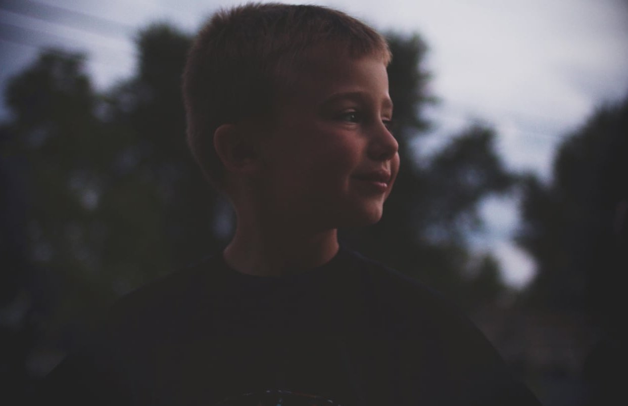
Skin tones naturally fall into the orange part of the color spectrum. Teal sits on the opposite side of the color wheel, which means pushing shadows toward teal creates instant contrast and visual separation between your subject and the background. This is why almost every Hollywood blockbuster, from action movies to romantic dramas, leans on this combination. Browse film stills on ShotDeck and you will spot it within minutes.
- Highlights warm up toward orange/amber
- Shadows cool down toward teal/cyan
- Midtones stay relatively neutral to keep skin natural
Before You Start: Prepare Your File
Color grading is the last 20% of the edit. If your base exposure and white balance are off, no amount of grading will save the image.
- Shoot in RAW for maximum flexibility
- Set the correct camera profile (Adobe Color or Adobe Neutral works best as a starting point)
- Balance exposure, highlights, and shadows in the Basic panel first
- Fix white balance before touching any grading sliders
Step 1: Base Adjustments in the Basic Panel
Start with a flat, balanced image. Here are the values we recommend as a starting point for most images.
| Slider | Portrait | Landscape |
|---|---|---|
| Contrast | -15 | -10 |
| Highlights | -40 | -55 |
| Shadows | +30 | +45 |
| Whites | +15 | +20 |
| Blacks | -20 | -25 |
| Texture | -10 | +10 |
| Clarity | -5 | +8 |
| Dehaze | +5 | +10 |

Step 2: Build the Cinematic Tone Curve
The Tone Curve is where cinematic mood is born. We want to create a matte film look by lifting the blacks and slightly compressing the highlights.
Point Curve Settings
- Lift the bottom-left point up by about 15 units on the Y-axis (this fades the blacks)
- Pull the top-right point down by about 8 units (softens highlights)
- Add a slight S-curve in the midtones for contrast
RGB Channel Curves
This is where the magic really happens.
- Red channel: pull shadows down slightly, push highlights up slightly
- Blue channel: push shadows up (adds blue/teal), pull highlights down (adds yellow/orange to highlights)
- Green channel: leave mostly untouched, or a tiny boost in shadows for the teal cast
Step 3: HSL Panel for Skin and Sky Control
Before touching the Color Grading wheels, refine individual colors with HSL.
Hue
- Red: -5 (deepens reds)
- Orange: -10 (pushes skin tones slightly warmer and richer)
- Yellow: -15 (turns yellow foliage more golden)
- Aqua: -20 (pushes aqua tones toward true teal)
- Blue: -10 (deepens sky)
Saturation
- Red: -10
- Orange: -5 (keeps skin natural)
- Yellow: -25 (kills distracting yellows)
- Green: -30 (essential to prevent neon foliage)
- Aqua: +15
- Blue: +10
Luminance
- Orange: +10 (brightens skin)
- Yellow: +5
- Green: -10
- Blue: -15 (deepens sky and shadows)
Step 4: The Color Grading Wheels
This is the heart of cinematic color grading in Lightroom. The three wheels let you independently push hue and saturation into shadows, midtones, and highlights.
| Wheel | Hue | Saturation | Luminance |
|---|---|---|---|
| Shadows | 210 (teal) | 25 | -5 |
| Midtones | 30 (warm) | 8 | 0 |
| Highlights | 40 (orange) | 20 | +5 |
| Global | leave at 0 | 0 | 0 |
Also adjust the Blending slider to around 60 and the Balance slider to +15 to push the look slightly more into the highlights, which makes skin glow without losing the teal shadows.
Step 5: Calibration Panel (The Secret Sauce)
Most tutorials skip this, but the Calibration panel changes the underlying behavior of every other slider. For a truly cinematic baseline:
- Red Primary: Hue +10, Saturation -5
- Green Primary: Hue -20, Saturation -10
- Blue Primary: Hue +15, Saturation +10
Step 6: Add Grain and Vignette
Film has grain. Digital files do not. To finish the cinematic look:
- Grain Amount: 15 to 25
- Grain Size: 25
- Grain Roughness: 50
- Vignette: -15, Midpoint 50, Feather 70
Portrait vs Landscape: Key Differences
For Portraits
Protect skin tones with a subject mask. Once you have the global grade, mask the subject and dial back the teal saturation in shadows by half. This keeps the actor-on-screen look while preventing greenish skin.
For Landscapes
Push the teal shadows harder (saturation up to 35) and use a linear gradient mask on the sky to add even more orange in golden hour scenes. For seascapes, a radial mask on the horizon with +0.5 exposure adds drama. The landscape tutorials on Digital Photography School show how far this can go before it looks artificial.
Before and After: What to Look For
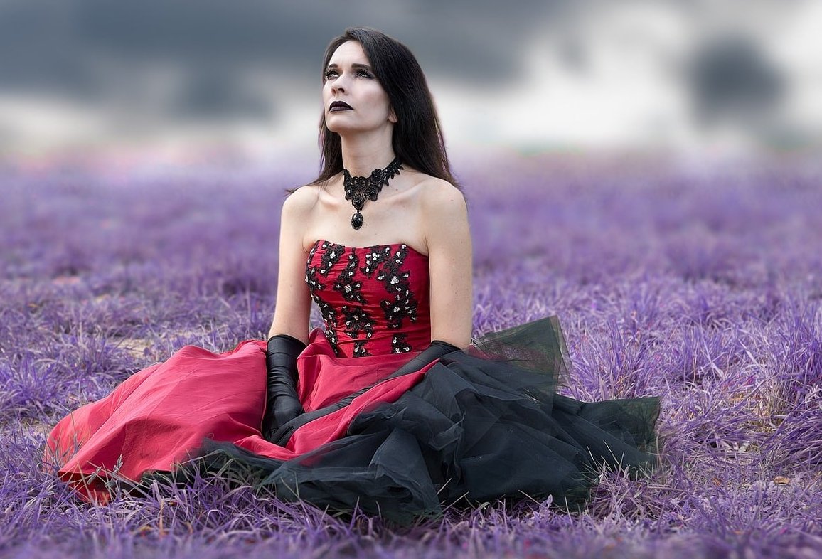
A successful cinematic edit should show:
- Clear color separation between subject and background
- Lifted, slightly faded blacks (no pure black point)
- Soft, warm highlights that never clip
- Skin tones that remain healthy and natural
- A cohesive mood that feels like a single frame from a film
Save It as a Preset
Once you nail your settings, save them as a preset so you can apply them in one click. Go to the Presets panel, click the + icon, and select only the settings you adjusted (Tone Curve, HSL, Color Grading, Calibration, Effects). Skip exposure and white balance so the preset adapts to each new image.
Common Mistakes to Avoid
- Oversaturating the teal: it quickly turns into a Smurf filter
- Ignoring white balance: a bad WB makes the grade look muddy
- Applying the same grade to every image: lighting conditions change everything
- Forgetting to mask the subject: skin will go green if you don’t protect it
- Skipping grain: clean files never feel truly cinematic
FAQ
Can I do cinematic color grading in Lightroom Mobile?
Yes. Lightroom Mobile has the same Color Grading wheels, HSL, and Tone Curve as the desktop version. All the values in this guide work identically on iOS and Android.
What is the best camera profile to start with?
Adobe Color is the most flexible starting point for cinematic grading. Adobe Neutral is even better if you want full control, since it gives you a flatter base to work from.
Do I need Photoshop for a cinematic look?
No. Since the Color Grading panel replaced Split Toning in 2020, Lightroom alone can deliver fully cinematic results. Photoshop is only needed for complex compositing or detailed retouching. If you are not on an Adobe subscription, editors such as ON1 Photo RAW offer comparable grading wheels and LUT support.
Why does my skin look green after grading?
The teal in your shadows is bleeding into the midtones where skin sits. Reduce shadow saturation, increase the Balance slider toward highlights, or use a subject mask to protect skin.
How do I keep the look consistent across a whole shoot?
Edit one hero image, save it as a preset, then sync it across the rest. Adjust exposure and white balance individually per image, but keep the color grading identical.
Final Thoughts
Cinematic color grading in Lightroom is not about copying one preset blindly. It is about understanding how shadows, midtones, and highlights work together to tell a story. Use the values in this guide as a starting point, then trust your eye to fine-tune each frame. The more you practice, the faster you will develop your own signature cinematic style.
Want us to grade your next campaign or wedding shoot in this style? Get in touch with the Impact Photography team and let’s create something cinematic together.