by Robert Wilcox | Jun 4, 2026 | Uncategorized
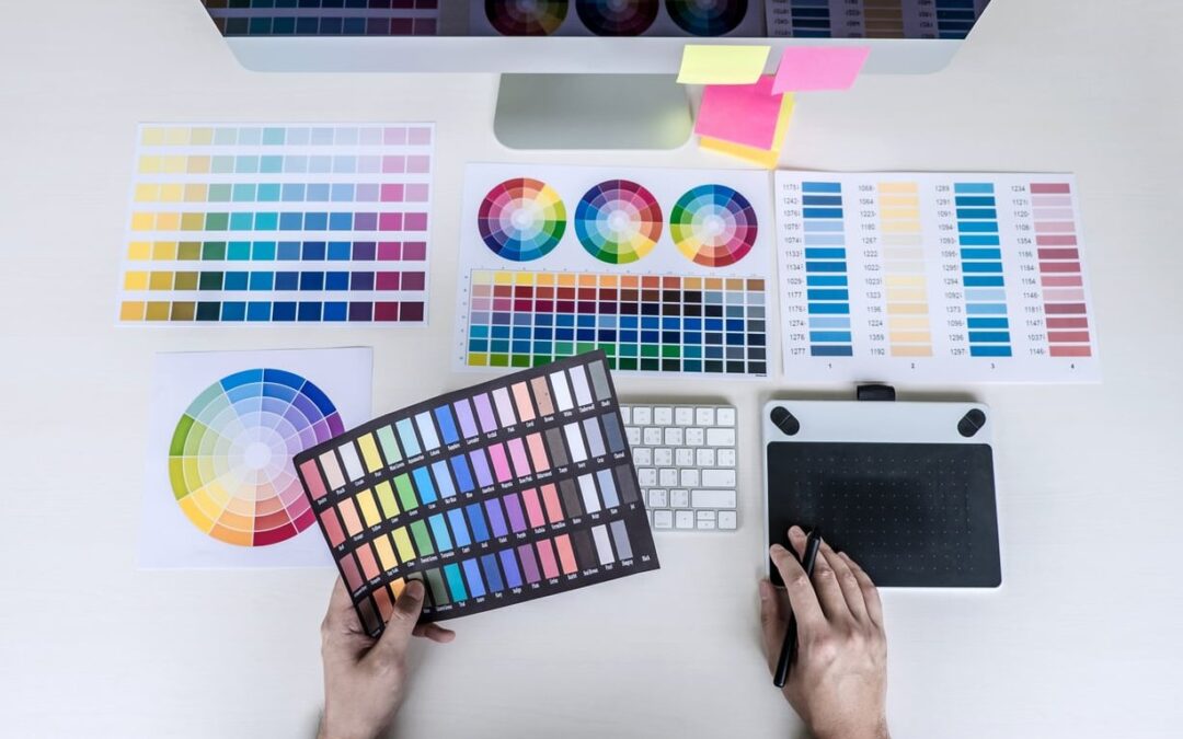
Choosing brand colors is not about picking pretty hues from a color wheel. It is a strategic decision that affects how customers feel, remember, and trust your business. After years of building visual identities for clients, we have refined a repeatable process that...

by Robert Wilcox | Jun 2, 2026 | Uncategorized
Most natural light portrait guides assume you have a giant north-facing window, white walls, and acres of empty space. Reality check: most of us shoot in a regular apartment with mixed light, cluttered backgrounds, and windows that face the wrong direction at the...

by Robert Wilcox | May 29, 2026 | Uncategorized
Whether you’re laying out a magazine spread, designing a landing page, or building a portfolio site, one principle separates clear communication from visual chaos: typography hierarchy. It’s the silent guide that tells readers where to look first, what to...

by Robert Wilcox | May 25, 2026 | Uncategorized
If you have ever exported a vibrant design from Photoshop only to receive a printed version that looks dull, washed out, or strangely shifted in tone, you have already met the difference between RGB and CMYK firsthand. At Impact Photography, we deal with this question...

by Robert Wilcox | May 22, 2026 | Uncategorized
Why Leading Lines Are the Backbone of Strong Landscape Composition If you have ever wondered why some landscape photographs feel immersive while others fall flat, the answer often comes down to one thing: leading lines. These are the natural or human-made lines within...