
Blog

How to Create Vector Illustrations from Hand-Drawn Sketches in Illustrator
Turning a paper sketch into a polished digital asset is one of the most satisfying workflows for any illustrator or designer. But many tutorials strip away the very thing that makes hand-drawn art special: its personality. In this guide, we walk through the complete...

How to Set Up a Home Photography Studio on a Budget Under $300
Build a Home Photography Studio on a Budget Without Sacrificing Quality You don't need a 3,000 square foot commercial space or $10,000 in lighting gear to shoot professional-looking portraits, products, or content. With smart choices and a clear plan, you can build a...

How to Shoot in Manual Mode: A Beginner’s Walkthrough with Real Camera Examples
Switching off auto mode feels intimidating. Three dials, a meter that bounces around, and the constant fear of missing the shot. The truth is that learning how to shoot in manual mode is not about memorizing theory, it is about knowing which numbers to start with and...

How to Retouch Skin in Photoshop: A Natural-Looking Frequency Separation Tutorial
Retouching skin in Photoshop is one of those skills that separates amateur portraits from professional ones. The challenge? Most tutorials teach you how to smooth skin, but they end up showing you how to make subjects look like wax figures. At Impact Photography, we...

How to Get Freelance Graphic Design Clients on Instagram and LinkedIn
If you're a freelance designer scrolling through Instagram and LinkedIn wondering why your follower count grows but your inbox stays empty, you're not alone. Most designers post beautiful work and hope clients magically appear. They don't. Getting freelance graphic...

Aperture and Depth of Field: How f-Stops Actually Change Your Photos
How Does Aperture Affect Depth of Field? If you have ever wondered why some photos have a creamy, blurred background while others keep every detail sharp from front to back, the answer almost always comes down to one setting: aperture. In this guide, we break down how...
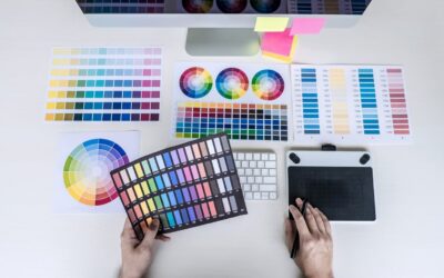
How to Create a Color Palette for a Brand: A 6-Step Process with Examples
Choosing brand colors is not about picking pretty hues from a color wheel. It is a strategic decision that affects how customers feel, remember, and trust your business. After years of building visual identities for clients, we have refined a repeatable process that...

Natural Light Indoor Portrait Photography: 9 Tips for Flattering Results at Home
Most natural light portrait guides assume you have a giant north-facing window, white walls, and acres of empty space. Reality check: most of us shoot in a regular apartment with mixed light, cluttered backgrounds, and windows that face the wrong direction at the...

Typography Hierarchy for Beginners: How to Structure Text That Guides the Eye
Whether you're laying out a magazine spread, designing a landing page, or building a portfolio site, one principle separates clear communication from visual chaos: typography hierarchy. It's the silent guide that tells readers where to look first, what to read next,...

RGB vs CMYK: Which Color Mode to Use for Print and Digital Design
If you have ever exported a vibrant design from Photoshop only to receive a printed version that looks dull, washed out, or strangely shifted in tone, you have already met the difference between RGB and CMYK firsthand. At Impact Photography, we deal with this question...